Tuesday, February 28, 2017

Book Covers: Required Information


Required Info on Book Covers:

Front:
Author's Name
Book Title

Spine:
Book Title
Author's Name
Publishing Company +/or Logo

 Back:
Brief Synopsis of book
Book Title/Author's Name/ Publisher


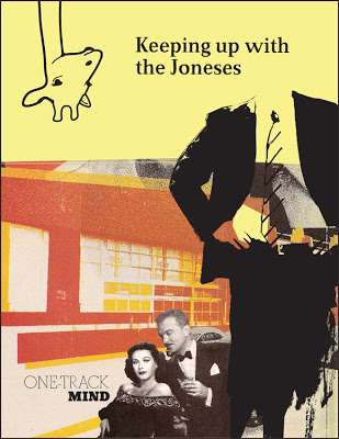
The Book project is also unique to each instructor and how they want to approach this project. Some Instructors want students to redesign a book jacket which already exists, making sure the students are familiar with the book and it's storyline. Other Instructors might give a more conceptual book cover assignments which were based on students selecting a graphic designer and then designing a book jacket which demonstrates the students knowledge and research of that designer (in the manner of their work.)Either are acceptable and you might come up with even a better idea as your proceed.

It's also another great opportunity to talk to students about color, texture, grids, type and hierarchy, legibility, composition, etc. Discuss it in class with the entire group and you'll see everyone's concepts improve during the discussion for sure.

Some Instructors will have the students not only mount their book covers on boards but also print out their book cover and have them wrap it around a real book to see what it actually looks like. Many student will photograph both the 3D book wrap and put it in their portfolio to apply to the graphic design major in late spring.


Saturday, February 11, 2017

Assignment 2: The Book Cover Redesign


The Design Assignment:
Create a book cover design which conveys a pivotal concept of the story, intrigues the viewer, and (ideally) compels them to buy the book.
As in the poster project, explore a variety of media and image- making techniques to discern which one(s) are most relevant to the concept and the story.


Specific Objectives:
 1. Research – Read the book; to develop more than a vague, surface-level interpretation of the story, you must have a feel for the language.
2. Develop your concept by exploring meaningful, innovative forms – photographic, illustrative, typographic, and abstract. What best conveys the setting, characters, conflict, and resolution of the story?
3. Create a cohesive composition of image and text.

General Assignment Objectives:

1. To engage in a thorough process of research, exploration, evaluation, and refinement 2. To present a well-crafted design that fulfills all criteria, and is completed by the deadline


Design Format:
Final should be a flat printed double-page spread of front, spine and back.

Required Content:
1. Your original image representing the story  (front/back/side)
2. Title of Book
3. Author's name (photo optional of author)
4. Publisher’s Logo

5. ISBN, price, barcode
6. Synopsis of the story (on back)


The Creative Process:
1. Read at least three pivotal scenes from the text. Get a clear notion of the arc of events. Show me which sections you read.

2. Write a one-paragraph overview of the story IN YOUR OWN WORDS. List out the main characters, setting, timeframe, and principle conflict(s) and any other interesting details. Build a moodboard of imagery.
3. Develop 10+ sketches for imagery ideas, 5+ illustrated solutions 5+ photographic solutions 5+ typographic solutions 5+ abstraction solutions
Denote the strongest two ideas that you will select from.
4. Sketch out or digitally compose 10 layout/compositional thumbnails of the 2 strongest ideas 
5. Choose the strongest solution.
6. Work out variations in color palette, typography, and composition; print at actual size
 

Starting the Conceptual Imagery Process:

Exploring specific types of imagery for the poster can lead you down unexpected paths, to surprising solutions. Regardless of your inclinations, you’re required to develop concept sketches in for categories:

Photographic – clearly the most realistic, it can still cover a wide range of subjects ... portrait, landscape, item(s), scenes, iconic or metaphoric (showing an item or object in a way which conveys something similar); consider point of view and composition of the frame; photography expresses largely through framing, point of view, technicalities of the process, and the subject itself

Illustrative – the power of illustration is in creating imagery that does not exist, that clarfies information, and/or that ex- presses through its media ( at color, watercolor, textures, and technique (strokes, line weights, color palette, etc.)


Typographic – using words, quotations, lyrics, or simple letter- forms to construct the sensibility of the story, its characters, setting, conflict, voice

Abstraction– the least realistic, abstract imagery is the most expressive, but only works if there is a tight focus on the distinctive characteristics of the event; otherwise an abstraction can be vague or unrelated; think of the image as being on the very edge of understanding ... it should
be comprehensible, and make sense, but only after a time of study and focus; we do not have much time to intrigue and then reward the audience, so this can be the most dif cult to execute successfully; examples could be patterns, textures, rhythms, and using the relationships between basic shapes or forms to convey meaning


Deadline for Personal Logo Assignment: Thursday February 23rd

Your current Personal Logo project is due on Thursday February 23rd.
The finished version should be a 12x18 print with the B/W version at the top of and the color version at the bottom.  (see example below.)

You can make the artboard either horizontal or vertical. It's up to you. Limit your color choices to 3 for your color version.


You should have at least 3 versions of your personal logo to show on Thursday February 16th (and then from there you'll choose 1 for your final version to be printed.

Below are examples of how your Personal logo might appear on the 12x18 page 
(These examples are companies but could easily be personal logos as well.)

You do not have to worry about indicating the PMS color swatches at the bottom.
Just the B/W version on the top; the Color version on the bottom (centered) and pay attention to scale. 


Monday, January 16, 2017

ASSIGNMENT 3: Cut & Paste: Digital Collage Poster Design Theme


To get a better understanding of how the Adobe Software works (Illustrator/Photoshop) this assignment allows you to cut and paste images you find in magazines/photos/web/original images and combine those into a 12x18 digital collage to be printed.This simple design process will allow you to understand the software of your choice while also designing a contemporary image that could be art in it'self.


Here are some past student designs using photoshop:


The collages below are from archival advertisements and throughout the history of collage design:


Size: 12x18
Media: Photoshop/Illustrator/Printed Materials
Printed for Critique
Influences:  You should be able to name a particular artist/designer who influenced your design.
That means some research into the artist of your choosing. Your design can still remain unique to your own point of view and artistic vision but you should have at least investigated an artist/designer who might have given you new insight into the collage process.

You could even use magazines/paper/printed materials and cut out images first and then scan them as a printed digital file. Think outside the creative box on this.

Theme: Choose a theme of your own choice that might apply itselt to the images you find and digitally collage to the format. All themes are open to you. Think of something you wish to say using found imagery (photos and type included) and then take a look at the history of collages in art.

It could be a portrait or landscape or something that is of concern to you like saving the environment, time change, religion, sexuality, politics or even some subject that might seem controversial. Experiement in visually telling a story through cut/paste method.

Due Date: TBA


A Cut-Down History of Collage

"Collage is the twentieth century's greatest innovation." — Robert Motherwell

"After Picasso and Georges Braque, collage became the most consequential visual-art form of the twentieth century." — Peter Schjeldahl

While artists have been layering images and incorporating autonomous elements into their work since the advent of paper, collage truly emerged as a medium in its own right in the early years of the 20th century with the Cubist experiments of Pablo Picasso and Georges Braque. The duo coined the term “collage” (from the French verb “coller,” meaning “to glue” or “to stick”) to describe works composed from pasted pieces of colored paper, newsprint, and fabric, considered at the time to be an audacious intermingling of high and low culture. It revolutionized modern art.

Whereas the artists’ earlier Cubist phase, known as “Analytic Cubism,” was comprised of paintings that fragmented the world into a series of basic lines and curves, this later period of “Synthetic Cubism” involved combining fragments of various materials to create a new whole. In Picasso’s iconic Still Life With Chair Caning (1912), perhaps the most famous work of this period, the artist playfully renders a tabletop still life by incorporating everyday elements like newspaper and rope, as well as a trompe-l’oeil piece of mass-produced oilcloth printed with a chair-caning pattern.

Inspired by Cubist experiments, artists associated with Dada—particularly the movement’s Berlin branch—began incorporating collage techniques into their work. Hannah Hoch, Richard Huelsenbeck, John Heartfield, and others pioneered the technique of photomontage, using preexisting photographs, often drawn from mass-media sources, to create composite images that sharply critiqued German society and culture in the aftermath of World War I.

Drawing on the foundations of Dada, neo-avant-garde artists of the 1950s like Robert Rauschenberg and Jasper Johns created assemblages that brought collage techniques into three dimensions—laying the groundwork for much contemporary sculpture—as well as works on paper that incorporated found elements drawn from the mass media and everyday life. Likewise, the incorporation of materials and images culled from mass culture and consumer goods was a signature of Pop art, exemplified by collage-based works like British artist Richard Hamilton’s Just What Is It That Makes Today’s Homes So Different, So Appealing? (1956), which ironically parodied the lifestyles peddled in advertising through the direct inclusion of its imagery.